The project itself :
Project Overview
As part of a 10-week SCADpro collaboration with Porsche, our team designed a next-generation in-vehicle experience for Porsche’s future electric vehicles. We focused on the digital ecosystem across the instrument cluster, center display, and companion app to reduce range anxiety, clarify EV-specific information, and keep the experience true to Porsche’s performance-driven brand.
Expand to see details
Framer is a design tool that allows you to design websites on a freeform canvas, and then publish them as websites with a single click.
All about the user :
User Research
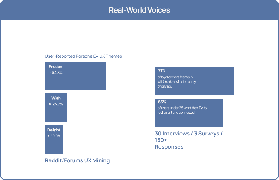
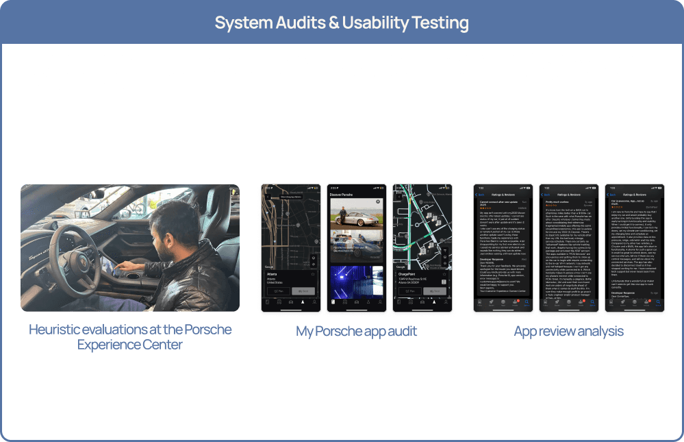
I collaborated with the team to combine expert EV HMI benchmarking, 30+ in-depth interviews, 160+ survey responses, and Reddit/forum mining to understand how current and aspiring Porsche EV drivers plan trips, manage charging, and use companion apps today. I was part of the research synthesis for the infotainment and app experiences; using card sorts, tree tests, and app audits to validate our information architecture; so that later motion and interaction decisions in the Porsche app were grounded in real driver needs, not just aesthetics.
Expand to see details
Framer is a design tool that allows you to design websites on a freeform canvas, and then publish them as websites with a single click.

The project schematically :
Starting the Design
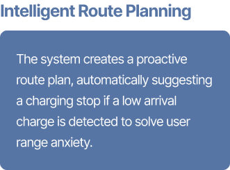
With our research and IA validation in place, I moved into designing the Porsche EV ecosystem. First, we rebuilt the information architecture for the infotainment and instrument cluster, then extended the same logic and visual language into the Porsche app. On the mobile side, I worked on the redesign of the pre-departure Trip Planner flow and its motion, turning our range-anxiety insights into a glance-safe, Porsche-grade experience.
Information Architecture
Rebuilding navigation for glance-safe driving and scalable EV features.
My first step was to validate and then rebuild the system’s information architecture. Iterative tree testing took the baseline in-car IA from a 36.4% direct-hit rate to 84% and cut average menu depth in half, so driver-critical tasks are always within two taps. This architecture became the backbone for the driver home, app launcher, and cross-domain dashboard. I then adapted the same structure for the My Porsche app, centering everything around a single pre-departure Trip Planner flow instead of scattered charging and route features.
+130% findability First-time Porsche Buyers (Next-Gen Enthusiasts)
Direct-hit rate improved from 36.4% → 84% after IA refinements.
50% shallower menus First-time Porsche Buyers (Next-Gen Enthusiasts)
Settings depth was cut in half, reducing how often drivers get lost in nested screens.
≤ 2 taps for critical tasks
All driver-critical actions were streamlined to be reachable within two taps or less.
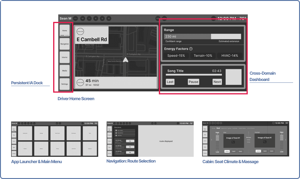
Infotainment & Cluster Wireframes
Defining the core layouts and states for the in-car system.
Using the validated IA as our blueprint, I worked with the in-car team to block out key screens for the driver home, app launcher, route selection, and cabin comfort. The wireframes introduce a persistent IA dock to prevent drivers from getting lost in deep menus and a cross-domain dashboard that surfaces navigation, energy, and media in one glance. While my main focus was the mobile experience, I reviewed and refined these wireframes to keep the in-car system aligned with the Trip Planner and our overall EV story.
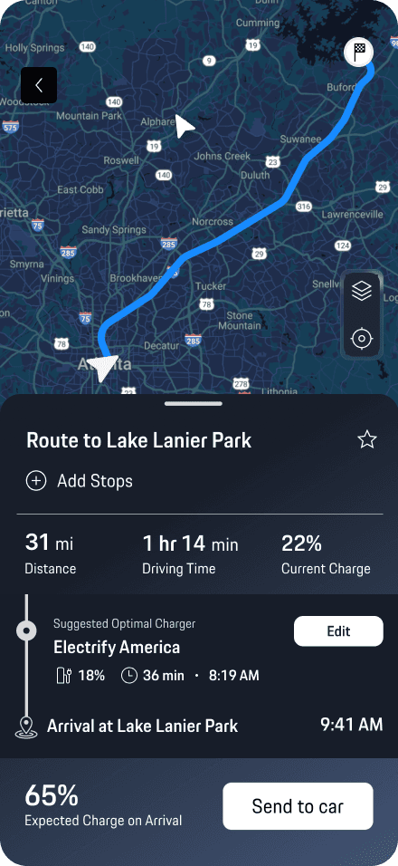
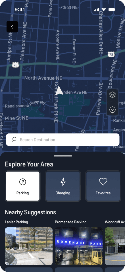
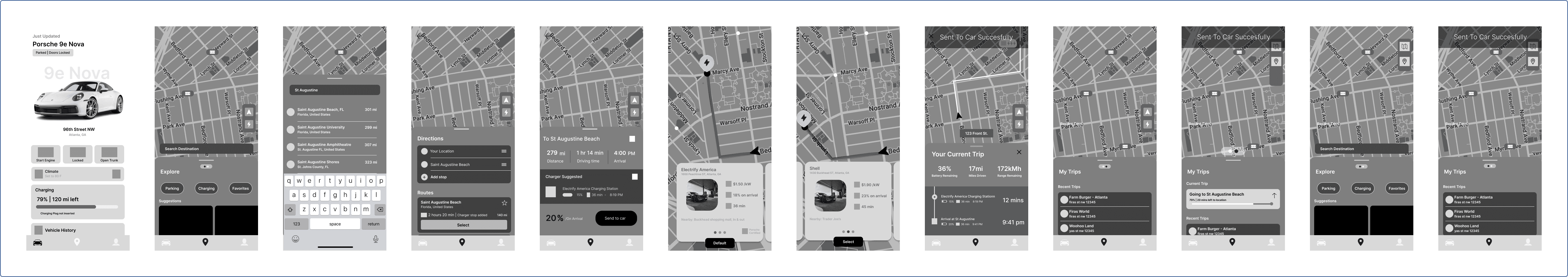
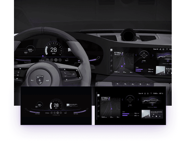
Mobile App: Trip Planner Flow
Mapping the end-to-end EV journey in low-fidelity before visual design and motion.
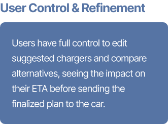
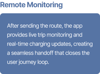
In parallel, I worked on the end-to-end redesign of the My Porsche Trip Planner flow, choosing pre-departure planning because it’s both high-impact and poorly executed in most OEM apps. Starting from low-fidelity sketches and moving into detailed Figma wireframes, I shaped a single, continuous sequence — Home → Search Destination → Route Overview → Send to Vehicle → Live Trip Card → Charging Overview — so drivers can plan, send, and monitor a trip without hunting through menus. The flow is guided by three design principles: Driver-First Clarity, Performance-with-Personalization, and Ecosystem Consistency, keeping the app as refined as the car itself.
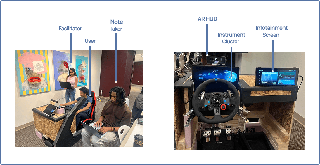
Usability Studies
Validating both in-car and mobile flows with real drivers.
Expand to see details
Framer is a design tool that allows you to design websites on a freeform canvas, and then publish them as websites with a single click.
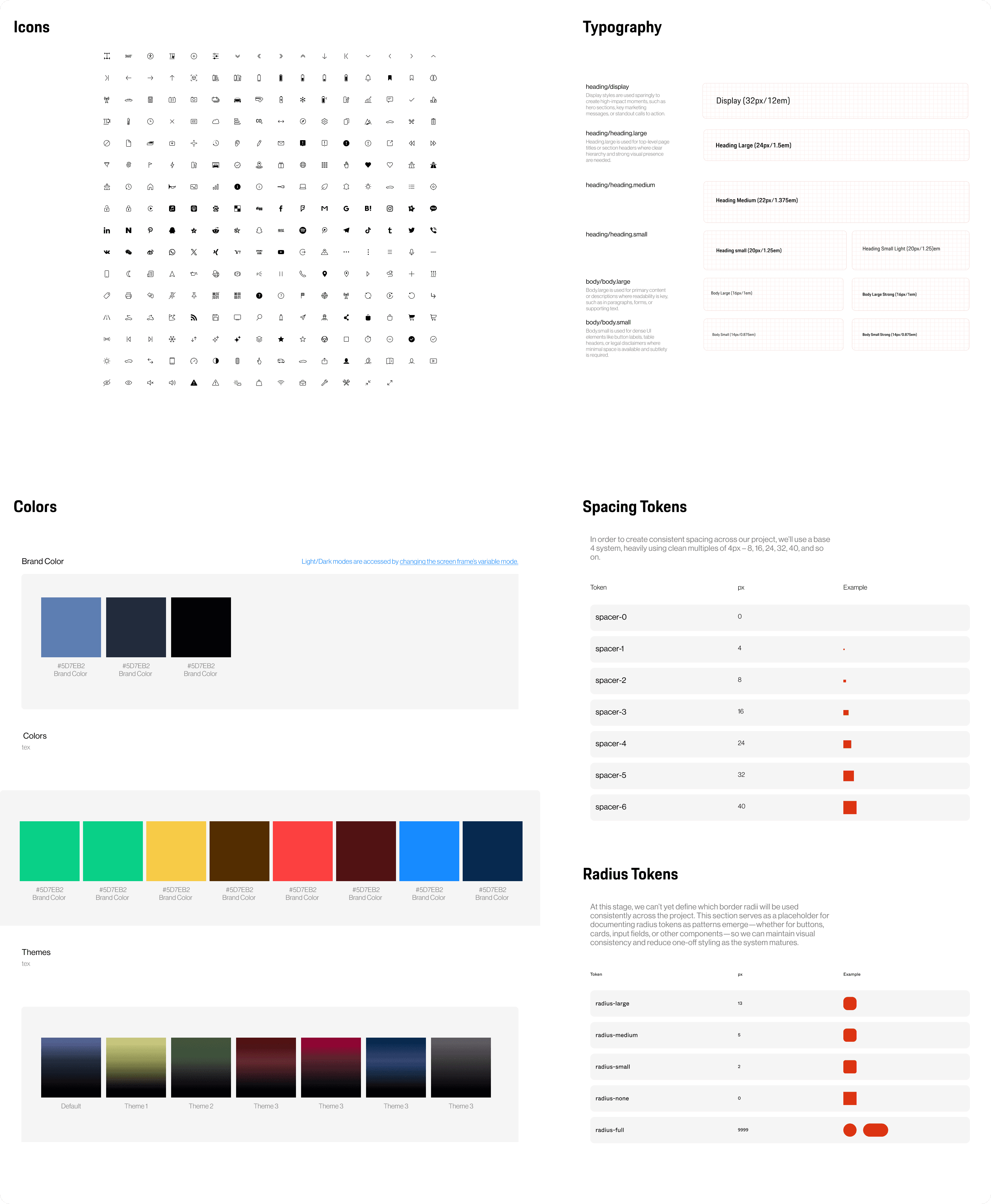
Mobile App Design System
After validating the IA and Trip Planner lo-fis, I focused fully on the My Porsche mobile app, joining the team that established its design system. We built a reusable library so EV features like Trip Planner could scale without redesigning every screen.
Expand to see details
Framer is a design tool that allows you to design websites on a freeform canvas, and then publish them as websites with a single click.
The clear version :
Refining Design
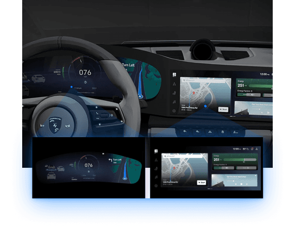
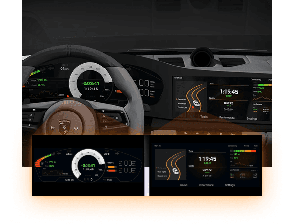
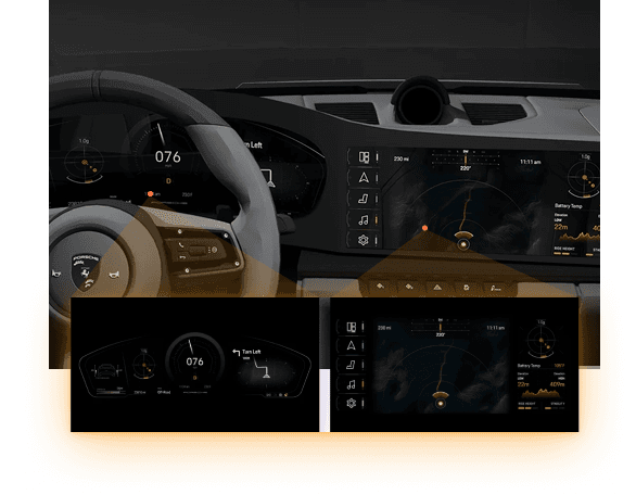
With the IA validated and the mobile design system in place, I moved into refining the visuals. On the in-car side, our lo-fi cockpit wireframes evolved into four driving modes—Comfort, Track, Off-Road, and Sport—all sharing the same IA but tuned for different contexts. In parallel, I focused on the My Porsche Trip Planner flow, bringing it to life with high-fidelity screens, motion, and interactions that feel unmistakably Porsche.
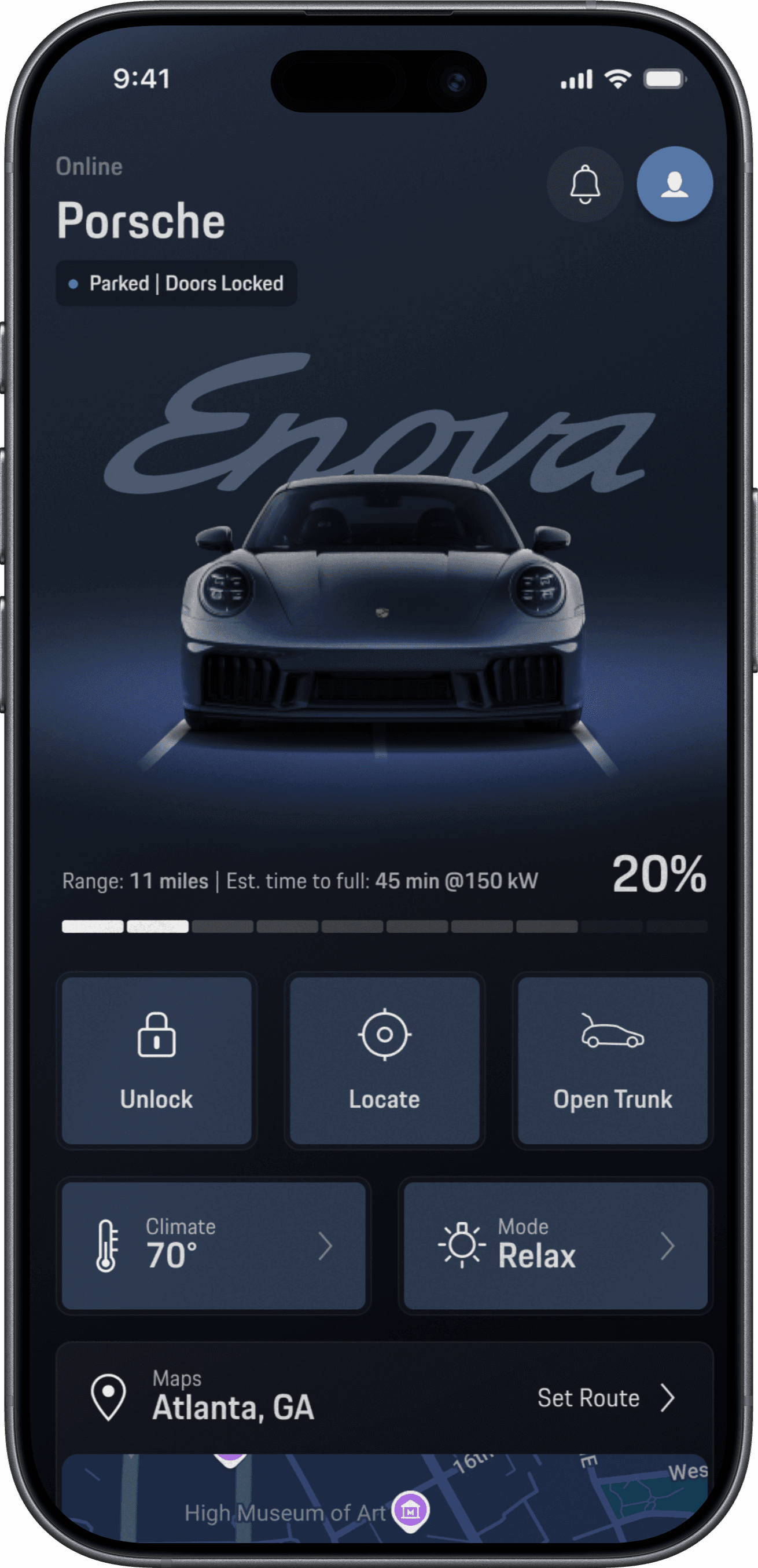
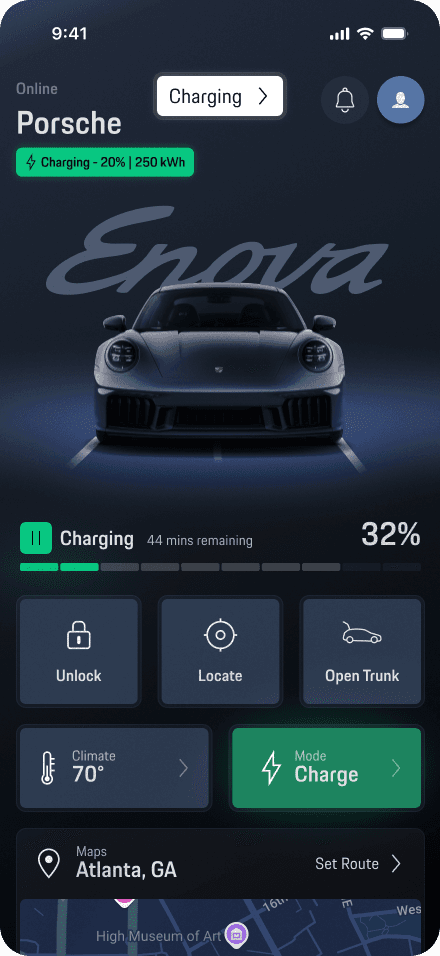
Mockups
High-fidelity screens for the final ecosystem.
I created high-fidelity screens for the mobile Trip Planner and collaborated on key infotainment states, applying our Porsche Next type system, color themes, and iconography. The mocks show the full EV journey—from home and map explore to route overview, live trip monitoring, and charging—so stakeholders could see how the experience holds together across phone and cockpit.
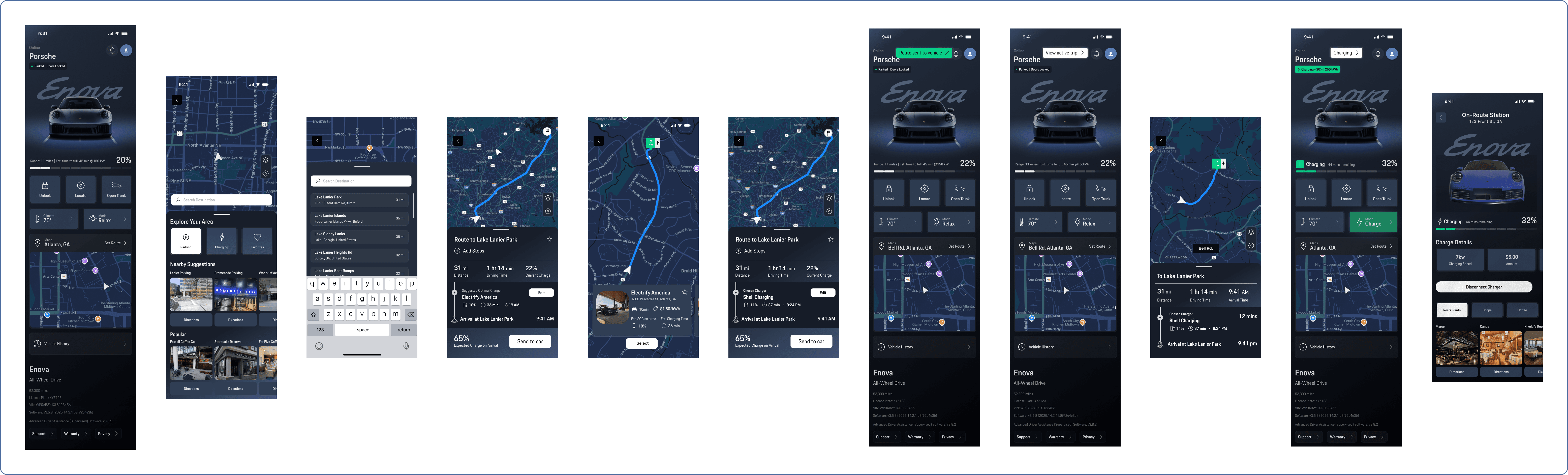
High-fidelity prototype
Interactive motion built in ProtoPie.
To test the Trip Planner in a realistic way, I rebuilt the flow as an interactive prototype in ProtoPie. I imported my Figma components, wired up each step with tap and scroll triggers, and used ProtoPie’s timeline to animate transitions, confirmations, and subtle state changes (like charger selection and “sent to car” feedback). This prototype was then used in Maze and in-person cockpit sessions to capture SUS scores and qualitative feedback.
Looking back on it :
Outcome
Looking back at the project, I wanted to highlight what changed for drivers and for Porsche, and what I personally learned from leading the mobile Trip Planner flow and its motion—plus how I’d evolve the system next.
Takeways
The key outcomes for drivers, Porsche, and the product ecosystem.
Impact:
The redesigned EV ecosystem made planning and driving feel more confident and connected. A clearer IA, four cockpit modes, and a focused Trip Planner flow reduced the friction of finding features, planning routes, and understanding range. The mobile app, cluster, and center display now tell a single, consistent story—helping drivers trust the car, not wrestle with the interface.
What I learned:
This project reinforced that structure comes before styling—getting the IA, flows, and copy right made every later motion and visual decision easier. I also learned how powerful a shared design system is when you’re designing across screens, and how tools like ProtoPie can turn static UI into a cinematic story that stakeholders and drivers instantly “get.”
Next Steps
How I’d extend the Porsche EV experience if we continued the work.
Explore how Trip Planner can support everyday EV use, not just long trips—surfacing smart suggestions for frequent routes, routine charging, and errands.
Layer in more adaptive intelligence across mobile and in-car—learning driver preferences over time and adjusting charger suggestions, notifications, and visual emphasis to each driver’s habits.
A deep dive into the process :
Process Book
For a deeper dive into the technical details and the project journey, check out the process book!